No page on a website has more implications for conversion and engagement than the home page. And no page has more variables to balance - visual, technical and political ones, to name a few.
When the time came to convert the Blue Shield of California home page to a new design system, I identified the opportunity to reorganize the page to serve the largest customer base - the members. Up to that point, the home page was an unfocused collection of information, requiring a convoluted workflow for members to get to something useful and informative. The new version is a cross-functional effort that puts members first, by focusing on their content and navigation options. The other constituents using the site - providers, employers and producers - are generally professionals who only come to the home page for awhile before bookmarking the sections dedicated to them. Therefore, they do not mind having their access points de-emphasized in favor of members.
But we did not take this fact for granted. Instead, I directed a unmoderated remote usability study to determine where people in all the constituent groups would click to access their information. We chose the option that allowed people to find their links the fastest.
After the migration, I directed another study to validate the new design. We found that people preferred the new design 2-to-1 over the old one. That, along with the great benefit of making the page manageable by content editors instead of developers, convinced us that we had made a significant improvement in the design.
So, we optimized the experience for members and prospective customers, rather than making every user figure out what parts of the page apply to them. The old design spread out member and prospective customer touch points all around the page, diluting their effectiveness and adding confusion. The professional users represented at the top of the old design did not need such prominent entry points; we proved this with usability testing.
To start the project on a firm footing, we used analytics data to find out where our various user groups were clicking on the old home page, and at what frequencies, before designing the new one. We found that many of our professional users - providers, employers and producers - did not access their sections through the home page at all, further bolstering our claim that the home page should be directed at existing and prospective members.

Placement of Important Functions in the New Design
This image represents the redistribution of functions for members on the new home page, mapped onto one of the designs we considered along the way.
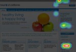
This heat map showed where one of our constituent groups tended to click when asked to find their portal. The fairly high error rate led us to reposition the links in the main content area. This also resulted in people finding the links faster, a win-win!
The new home page design is optimized for existing and prospective members, and presents the entry points to the three other main constituent groups in the main content area.


